A Comprehensive Guide to the Best Web Fonts for 2024 + SEO Tips | Web Designer Blog
- Crystal Coded

- Jan 23, 2024
- 16 min read
Updated: Apr 11

Fonts are not merely decorative elements; they are integral to communicating the brand personality, setting the tone, and enhancing the readability of the content on a website. The careful consideration of fonts can contribute significantly to the overall design harmony, ensuring that the visual elements align with the brand identity and resonate with the target audience.
Throughout this guide, we will delve into the diverse styles of what we believe to be the best web fonts for 2024, ranging from timeless classics to innovative contemporary choices. Each font possesses its own unique characteristics, which can evoke different emotions, convey specific messages, and create memorable impressions on visitors.
Moreover, we will explore the functionalities of these web fonts, examining how they perform across various devices and screen sizes. With the increasing prevalence of mobile and tablet usage, responsive design is paramount, and the selected fonts should adapt seamlessly to different platforms without compromising the visual integrity of the website.
Beyond aesthetics, the guide will address the impact that these fonts can have on your online presence. An effective web font not only enhances the visual appeal but also contributes to brand recognition and user engagement. We will discuss the psychological aspects of font selection, considering factors such as readability, trustworthiness, and the ability to capture the audience's attention.
In summary, this comprehensive guide is a valuable resource for web designers, developers, and businesses seeking to optimize their online presence in 2024. By understanding the nuances of various web fonts, their styles, functionalities, and impact, you can make informed decisions that elevate the design and user experience of your website, ensuring it stands out.


Best Web Font for 2024: Roboto
WHY ROBOTO IS A WINNER: A TIMELESS CLASSIC
Roboto, a typeface crafted by Google, has evolved from its origins to achieve the status of a modern classic in the realm of web design. This font is distinguished by its clean and versatile style, making it a preferred choice for a wide array of online applications. Roboto has been specifically designed to prioritize optimal readability across various devices, contributing to a seamless and consistent user experience.
The clean aesthetic of Roboto is a hallmark of its design, characterized by well-defined letterforms and a balanced visual simplicity. This clarity ensures that the font maintains legibility even in different contexts and sizes, catering to the diverse range of screen dimensions found across the multitude of devices users employ to access websites. Whether viewed on a desktop monitor, laptop, tablet, or smartphone, Roboto adapts gracefully, upholding its visual integrity and readability.
Versatility is another key attribute that sets Roboto apart. Its adaptable design allows it to harmonize with different design elements and layouts, making it suitable for a variety of web design projects. From minimalistic interfaces to more complex and content-rich websites, Roboto's versatility enables it to complement diverse visual styles and brand identities.
One of the strengths of Roboto lies in its commitment to providing a consistent user experience. By maintaining readability across devices, users encounter a seamless transition as they navigate through a website, regardless of the platform they are using. This consistency is vital for fostering positive user interactions, establishing trust, and ensuring that the content is accessible and engaging across the entire spectrum of digital devices.
In essence, Roboto stands as a testament to Google's dedication to enhancing the web typography landscape. Its clean and versatile design, coupled with a focus on optimal readability, positions it as a reliable and enduring choice for web designers and developers. As a modern classic, Roboto continues to play a pivotal role in shaping the visual language of the internet, embodying the principles of clarity, versatility, and a consistent user experience.

Roboto's Font SEO impact:
The neutrality and readability inherent in the design of Roboto make a substantial positive contribution to the overall user experience of a website. This is particularly crucial as search engines, such as Google, increasingly prioritize user experience as a key factor in determining website rankings. By incorporating Roboto into your website, you not only elevate its visual aesthetics but also align with SEO (Search Engine Optimization) best practices, potentially influencing your website's performance in search engine results.
Moreover, the readability of Roboto ensures that the text is accessible and easily comprehensible across various devices and screen sizes. In the context of SEO, readability is a critical aspect, as search engines prioritize delivering content that is user-friendly and can be consumed effortlessly by a diverse audience. Websites with content that is easy to read and understand are more likely to be ranked higher in search engine results.
Search engines consider user experience metrics, such as bounce rate and time spent on a page, as indicators of the quality of a website. When users have a positive experience, they are more likely to stay on a site longer and interact with its content. By choosing a font like Roboto that enhances readability and overall visual appeal, you contribute to creating a positive user experience, potentially leading to improved SEO performance.
In summary, the decision to incorporate Roboto into your website extends beyond aesthetics; it aligns with SEO best practices by enhancing neutrality and readability. As search engines increasingly prioritize user experience as a ranking factor, opting for a font like Roboto can positively influence your website's standing in search results, ultimately contributing to increased visibility and traffic.

Best Web Font for 2024: Montserrat
WHY MONTSERRAT IS A WINNER: ELEGANCE

The choice of Montserrat for web design is a deliberate strategy to ensure that a website stands out with a distinctive and refined visual identity.
Montserrat achieves a unique blend of elegance and modernity, making it a versatile font that caters to a broad spectrum of design preferences. The font's geometric shapes contribute to a sense of order and precision, while its open letterforms add a touch of modernity. This delicate equilibrium between traditional elegance and contemporary design principles positions Montserrat as an exceptional choice for various typographic elements on a website.
Whether used in headlines or body text, Montserrat maintains its impact and readability. The font's design versatility allows it to seamlessly transition between different font sizes and applications, making it an ideal choice for creating cohesive and visually appealing content throughout a website. Its sleek and stylish aesthetic adds a touch of sophistication to the overall design, enhancing the user experience and leaving a lasting impression on visitors.
Moreover, Montserrat's ability to resonate well with diverse audiences is a testament to its universal appeal. The font's clean lines and modern sensibility make it suitable for a wide range of industries, from corporate websites to creative portfolios. Its adaptability ensures that it can effectively communicate a brand's message regardless of the target audience, making Montserrat a reliable and inclusive choice for designers aiming to connect with diverse user demographics.
In essence, when standing out is the goal, Montserrat proves to be an effective ally in achieving a balance between classic elegance and contemporary design trends. Its geometric shapes and open letterforms create a sleek and stylish aesthetic that not only enhances the visual appeal of a website but also ensures that the content resonates positively with a diverse and discerning audience.

SEO Optimization Tip for Montserrat:
The strategic use of the Montserrat font in your website design can have a positive impact on its SEO performance, particularly in terms of enhancing overall readability.
Search engines, such as Google, prioritize user experience as a critical factor in determining the ranking of websites. Readability is a significant component of user experience, and search algorithms favor websites that offer a seamless and enjoyable reading experience for visitors. Montserrat, with its clean and well-defined letterforms, contributes to this seamless reading experience.
The font's clarity and legibility ensure that the text on your website is easily comprehensible, even on various devices and screen sizes. This is crucial for engaging users and keeping them on your site for longer periods, as search engines take into account metrics like bounce rate and time spent on a page when evaluating the quality of a website.
By choosing Montserrat, you align your website with SEO best practices, as the font enhances the overall user experience. This strategic decision can positively influence how search engines perceive and rank your website. Websites that prioritize readability are more likely to rank higher in search results, as they are deemed more user-friendly and, therefore, more valuable to online audiences.
In summary, the utilization of Montserrat goes beyond its visual appeal; it becomes a practical tool for SEO optimization. The font's contribution to enhanced readability aligns perfectly with the preferences of search algorithms, making Montserrat an excellent choice for optimizing your website's content and improving its standing in search engine results.

Best Web Font for 2024: Inter
WHY INTER IS A WINNER: VERSITILITY

Inter takes center stage as a font explicitly crafted for digital screens, showcasing a design that not only adheres to the demands of modern digital interfaces but also exudes a clean and contemporary aesthetic. This font stands out for its remarkable versatility, seamlessly blending a sleek appearance with adaptability across a spectrum of use cases.
Designed with screens in mind, Inter addresses the specific challenges posed by digital platforms, ensuring optimal readability and visual appeal. Its clean lines and modern styling contribute to a typographic aesthetic that feels at home in the digital landscape. The font's thoughtful design caters to the nuances of on-screen rendering, making it a standout choice for websites, applications, and various digital interfaces.
One of Inter's key strengths lies in its adaptability, transcending the boundaries of traditional font roles. It excels not only as body text but also as a captivating option for headlines and headings. The versatility of Inter ensures that it can maintain legibility and impact across different font sizes and weights, making it an excellent choice for creating cohesive and visually engaging content throughout a digital project.
Whether conveying information in paragraphs or making a bold statement in headers, Inter remains consistent in delivering a modern and polished appearance. Its versatility makes it suitable for a wide range of digital design applications, from user interfaces to online publications, where a harmonious blend of style and readability is paramount.
In summary, Inter emerges as a font designed to shine in the digital spotlight. Its clean and modern aesthetic, coupled with exceptional versatility, positions it as a valuable asset for designers seeking a font that not only adapts seamlessly to digital screens but also enhances the visual appeal and readability across various use cases.

Noteworthy Features and SEO Benefits:
Inter's commendable support for multiple languages and its incorporation of variable font capabilities elevate its standing as a font designed for the modern digital landscape. This broad linguistic support and variable font functionality not only contribute to a consistent and engaging user experience but also align with SEO (Search Engine Optimization) best practices, thereby fostering improved user satisfaction and potentially leading to enhanced search engine rankings.
The ability of Inter to support multiple languages is a significant advantage in our interconnected global digital environment. Websites and applications often cater to diverse audiences around the world, each with its unique linguistic preferences. By offering multilingual support, Inter ensures that content can be presented accurately and legibly in various languages, fostering inclusivity and accessibility for a broader user base.
Moreover, the incorporation of variable font capabilities is a forward-looking feature that aligns perfectly with the dynamic requirements of contemporary design. Variable fonts allow for the adjustment of various typographic attributes such as weight, width, and slant, providing designers with greater flexibility in customizing the appearance of text. This adaptability ensures that Inter can maintain its visual integrity across different devices and screen sizes, delivering a seamless and engaging user experience.
These features, supporting multiple languages and embracing variable font capabilities, go beyond mere design considerations. They contribute to SEO best practices by enhancing the overall user experience. Search engines prioritize user satisfaction, considering factors such as the time users spend on a site and how well they engage with its content. The consistent and engaging experience facilitated by Inter can positively impact these metrics, potentially leading to improved search engine rankings.
In summary, Inter's support for multiple languages and variable font capabilities positions it as a font that not only meets the demands of modern digital design but also aligns strategically with SEO objectives. By fostering a user-friendly and inclusive experience, Inter contributes to enhanced user satisfaction, which, in turn, can positively influence search engine rankings.

Best Web Font for 2024: Space Grotesk
WHY SPACE GROTESK IS A WINNER: BOLD & FUTURISTIC
As we step into 2024, Space Grotesk takes the forefront with its bold, sans-serif design that encapsulates a futuristic aesthetic. This font stands out for its distinctive characteristics, featuring geometric shapes and clean lines that contribute to a modern and forward-looking visual style. Designed with precision and a contemporary sensibility, Space Grotesk emerges as an ideal choice for headlines and display purposes, enabling websites to make a powerful and visually striking statement.
The geometric shapes inherent in Space Grotesk's design contribute to a sense of order and precision, creating a visual harmony that aligns seamlessly with contemporary design trends. The clean lines enhance legibility and maintain clarity even in larger font sizes, making it well-suited for display purposes where clarity and impact are paramount. Choosing Space Grotesk for headlines and display purposes allows websites to convey a sense of modernity and innovation.
In essence, as we embrace the year 2024, Space Grotesk stands as a typographic representation of boldness and modernity. Its geometric shapes, clean lines, and sans-serif design collectively contribute to a font that allows websites to project a visually striking and forward-looking image, making it an impactful choice for those seeking to make a bold statement in their digital presence.

Best Use Cases and SEO Considerations:
Space Grotesk proves to be an excellent choice, particularly for websites in the tech, fashion, and creative industries, where its futuristic vibe can play a pivotal role in setting the tone for a brand. This font's bold and avant-garde design aligns seamlessly with the aesthetics often associated with these industries, making it an ideal typographic choice to convey a sense of modernity, innovation, and creativity.
From an SEO perspective, the bold design of Space Grotesk becomes a strategic asset. Search engines value metrics such as bounce rate, time spent on a page, and overall user engagement. The font's bold and attention-grabbing characteristics can capture visitor attention, encouraging them to stay on the website for longer durations. This positive impact on user engagement metrics is likely to be viewed favorably by search engines, potentially leading to improved search rankings.
In summary, Space Grotesk's futuristic vibe makes it a compelling choice for tech, fashion, and creative websites, allowing it to set the desired tone for a brand. From an SEO standpoint, its bold design can contribute to capturing and retaining visitor attention, aligning with the metrics that search engines prioritize for evaluating the quality and relevance of a website.
Best Web Font for 2024:
WHY RECURSIVE IS A WINNER: TRENDY & CUSTOMIZABLE

Recursive emerges as a font that transcends traditional typographic boundaries, positioning itself as a versatile and innovative variable font family. This characteristic sets Recursive apart by offering unparalleled customization options. More than just a font, Recursive provides designers with a powerful tool to shape and define a unique and on-brand visual identity for a variety of design projects.
At the heart of Recursive's appeal is its status as a variable font family. This means that within the font family, designers have the flexibility to adjust a range of attributes, such as weight, width, and slant. This level of customization allows for a nuanced and tailored approach to typography, enabling designers to fine-tune the font's appearance to suit the specific requirements of a brand or project.
The inclusion of multiple styles and weights within the Recursive font family further enhances its versatility. Whether a designer aims for a sleek and minimalist aesthetic or a bold and expressive one, Recursive provides the tools to achieve the desired outcome. This adaptability makes it an empowering choice for designers seeking to establish a consistent and cohesive visual identity across various elements of a project, from headlines to body text.
By offering a spectrum of customization options, Recursive becomes more than just a static font; it becomes a dynamic and evolving design tool. Designers can experiment with different variations to find the perfect balance that aligns with a brand's personality and visual language. This flexibility is particularly valuable in creating a distinctive and memorable brand identity that stands out.

Customization Benefits and SEO Implications:
The distinctive feature of Recursive, offering customizable parameters such as weight, slant, and more, empowers websites to present a unique and individualized personality through their typography. This level of customization goes beyond mere aesthetics, allowing for the creation of a visual identity that stands out and aligns closely with the brand's character. From an SEO perspective, this uniqueness and well-branded design contribute significantly to fostering a memorable user experience, a key factor that search engines prioritize in their algorithms.
The ability to customize weight, slant, and other parameters within Recursive provides web designers with a toolkit to tailor the font to match the specific vibe and personality of a website. Whether a brand seeks a bold and assertive appearance or a more subtle and refined one, Recursive allows for the fine-tuning of typographic elements to perfectly reflect the brand's identity. This level of personalization enables websites to differentiate themselves in a crowded digital landscape, making a lasting impression on visitors.
From an SEO standpoint, user experience is a paramount consideration for search engines when determining the relevance and quality of a website. A unique and well-branded design, facilitated by the customization options in Recursive, contributes to creating a memorable and engaging user experience. When visitors find a website visually appealing, distinctive, and aligned with the brand's identity, they are more likely to stay longer, explore content, and interact positively. These user engagement metrics, such as time spent on the site and low bounce rates, are crucial signals that search engines use to gauge the quality and relevance of a website.

Best Web Font for 2024: Bebas Neue
WHY BEBAS NEUE IS A WINNER: BOLD PRESENCE
Bebas Neue Pro stands as a contemporary iteration of the classic Bebas Neue, introducing a modernized and refined version of the renowned typeface. Renowned for its bold and uppercase design, Bebas Neue Pro possesses a commanding presence that instantly captures attention. Its pronounced impact, particularly when applied to headlines and banners, solidifies its position as a premier choice for brands aiming to establish a visual identity characterized by authority and confidence.
The bold and uppercase nature of Bebas Neue Pro serves as a powerful visual element, making it well-suited for conveying messages that demand attention. The robust strokes and capital letters create a striking and assertive appearance, allowing the font to make a bold statement on various design elements, from headlines on websites to banners in advertising materials.
The modern update to the classic Bebas Neue further ensures that Bebas Neue Pro aligns with contemporary design trends. While retaining the essence of the original, the Pro version introduces refinements that enhance its versatility and applicability in various design contexts.
In essence, Bebas Neue Pro is more than a font; it's a design choice that commands attention and communicates a sense of authority. Its bold and uppercase design, especially impactful in headlines and banners, positions it as a preferred option for brands seeking to make a strong visual statement and establish a brand identity characterized by confidence and influence.

Best Suited Scenarios and SEO Considerations:
This font is strategically crafted to capture user attention effectively, and this attribute plays a crucial role in adhering to SEO best practices. The ability of Bebas Neue Pro to create a visually striking impact contributes directly to a website's capacity to retain visitors, thereby generating positive SEO signals. When applied to headlines, banners, or other prominent elements on a website, it stands out, drawing the eye and encouraging users to engage with the content. This immediate attention-grabbing quality is valuable for brands aiming to leave a memorable impression on their audience.
From an SEO perspective, user engagement metrics, such as time spent on a page and low bounce rates, are critical factors considered by search engines when evaluating the quality and relevance of a website. Bebas Neue Pro's ability to captivate user attention contributes significantly to keeping visitors on the site for longer durations. This extended engagement can result in positive signals that search engines interpret as indicators of a high-quality and relevant website.
Moreover, the bold visual statement made by Bebas Neue Pro aligns with the contemporary emphasis on user experience in SEO algorithms. A website that employs visually striking elements, such as impactful typography, contributes to an overall positive user experience. This, in turn, enhances the likelihood of repeat visits, further solidifying the website's standing in search engine rankings.
In summary, Bebas Neue Pro not only caters to brands seeking a bold visual identity but also aligns strategically with SEO principles. This synergy between visual impact and user retention positions Bebas Neue Pro as a font that not only makes a statement but also supports a website's SEO objectives.
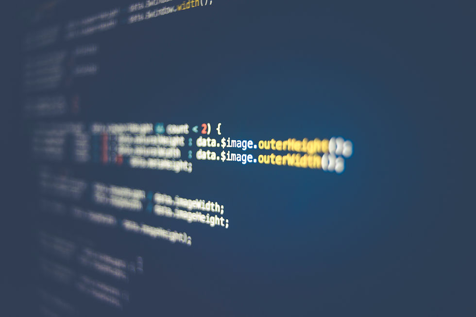
Best Web Font for 2024: Fira Code
WHY FIRA CODE IS A WINNER: DEVELOPER FRIENDLY

Fira Code distinguishes itself by adopting a unique approach centered around enhancing the coding experience. Designed with a specific focus on programming, this font incorporates ligatures that play a pivotal role in improving code readability. As a result, Fira Code has garnered widespread acclaim among developers and has emerged as a preferred choice for tech-oriented websites.
The inclusion of ligatures in Fira Code is a key feature that sets it apart. Ligatures are special characters that combine multiple adjacent characters into a single, visually distinct symbol. In the context of coding, ligatures can enhance the clarity and visual flow of complex code structures, making it easier for developers to read and comprehend. This emphasis on readability is crucial in the world of coding, where precision and quick comprehension are paramount.
Fira Code's popularity among developers stems from its ability to create a more visually intuitive representation of code, especially in scenarios involving commonly used coding constructs such as arrows, operators, and logical combinations. The font's thoughtful design optimizes the presentation of these elements, reducing visual clutter and making the code more approachable.
As an ideal choice for tech-oriented websites, Fira Code contributes to creating a seamless and user-friendly experience for developers and visitors alike. When applied to code snippets on a website, Fira Code not only enhances readability but also aligns with the preferences of the tech community. Its adoption signifies a commitment to providing a coding environment that prioritizes visual clarity and ease of understanding.
In summary, Fira Code stands out as a font tailored for the coding experience, with ligatures that significantly enhance code readability. Its widespread acceptance among developers and its suitability for tech-oriented websites underscore its effectiveness in providing a visually optimized coding environment. Fira Code's unique stance as a font designed for the technical community highlights its importance in fostering a positive and efficient coding experience.
Aesthetic Coding and SEO Considerations:
Elevating the aesthetic of code snippets, as achieved by Fira Code's emphasis on readability through ligatures, goes beyond just improving the developer's experience—it contributes to a more engaging and satisfying experience for both developers and website visitors. Although not a traditional SEO element, the positive impact of Fira Code on user engagement indirectly influences SEO by fostering a user-friendly and content-rich environment.
The aesthetics of code snippets play a significant role in the overall user experience, especially on tech-oriented websites. When developers encounter clean and visually optimized code, it not only enhances their understanding but also makes the coding environment more enjoyable. This positive experience can translate into increased engagement, as developers may spend more time exploring and interacting with the code presented on the website.
Additionally, for non-developer visitors who might encounter code snippets while exploring tech-related content, a visually appealing and well-formatted presentation can make the information more accessible and digestible. This can contribute to a positive overall impression of the website, encouraging visitors to stay longer and engage more deeply with the content.
From an SEO perspective, user engagement metrics such as time spent on a page, low bounce rates, and overall satisfaction are increasingly crucial factors in search engine algorithms. While Fira Code itself may not directly influence these metrics, the enhanced coding experience it provides can contribute to a more engaging and satisfying user experience on tech-oriented websites. Websites that prioritize user satisfaction are likely to see improved user engagement metrics, which, in turn, can positively impact their search engine rankings.
In essence, Fira Code indirectly influences SEO by contributing to a more engaging and visually appealing coding experience. This focus on user satisfaction and positive engagement aligns with the broader trends in search engine algorithms, emphasizing the importance of providing a high-quality and user-friendly experience for website visitors.
Conclusion: Embracing the Possibilities
As we traverse the landscape of 2024, these web fonts offer a glimpse into the future of web design. Whether your goal is a sleek and modern aesthetic, a bold and futuristic vibe, or a unique and customizable identity, the choices are abundant. Experimentation, customization, and an open embrace of these fonts will undoubtedly shape the visual identity of your website and leave a lasting impression.


Comments